The Cover
Project
The Cover Project is an opportunity to combine the design elements of typography, photography, and illustration into a cohesive and compelling composition.
Your cover project can be a:
Book cover
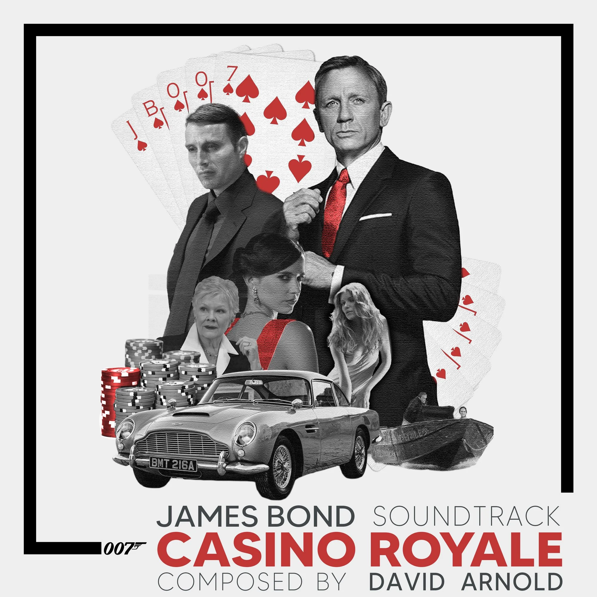
Album cover
Magazine cover
Video game cover
For all cover types, the cover can be real or imaginary. The challenge is to design a cover in a style aligned with the theme and content of the chosen media. (e.g., the selected photos, fonts, colors, etc. of a rock album should evoke a sense of this musical genre.)
You can use Photoshop alone or Photoshop in combination with Illustrator for this project.
Assessment
As with all Pro Projects, keep in mind that your work will be assessed by:
Professionalism - Project is done "to spec", follows directions, and fulfills all requirements.
Craftsmanship - Project exhibits an admirable application of design principles, an aesthetic style, and use of app workflows.
Challenge - There is producible evidence that the final design underwent the entire design process and was significant challenging.
Originality - Project content is unique (not copied, derivative, a template, AI generated in part or whole, or a reproduction of a tutorial).
*Note: Images depicting drug use, guns, violence, etc. are not permitted.
Process
1. Communicate
Start by picking a favorite book, album, magazine or game - and give yourself a client questionnaire in order to form a clear design brief.
Here are the essential question you need to ask yourself
What is the essence of the story, music, etc. that is conveyed in this media - how can this be made clear visually?
Who is the audience? What visual elements (colors, fonts, styles, etc. would resonate with them?)
What essential typography is required (title, author, etc.)?
What photographic or illustration style best suites this cover?
2. Research
Based on your design brief, visit the following websites and conduct some related searches:
Google (related cover, band, game, etc. search)
Dribbble (layouts and design styles)
Dafont (tons of fonts)
Google Fonts (curated fonts)
TextureLab (great, free textures)
Pexels (high-res, copyright free photos)
If a cover, font, etc resonates with you, screen grab it using the snip tool (PC) or with cmd+opt+4 (Mac). After you have +20 images, drop the collective images into gomoodboard.
Please note to add a comment to the submission that clarifies:
What kind of cover?
What specific album, game, book are you designing?
3. Ideate
Based on your moodboard, grab your sketchbook and draw at least 6 possible cover solutions.
From these initial 6 solutions, selected one. Flip the page over and draw 6 new variations based on the initial solution you selected.
From this second round of 6, pick your top solution.
Before you fully commit, get some feedback from classmates, family, . . . anyone you can. Listen to learn - and be open to suggestions - you might come up with an even better solution with some outside feedback.
4. Formalize
Using Photoshop, take the very best of your moodboard assets and your top solution for your ideations, and design your Cover Project.
Specs and
Standards
Your cover should be setup and turned in with the following specs:
Industry-standard dimensions for given media. Research specialty sizes or use the following standards*:
Album:10 x 10in
Book: 6 x 9in
Magazine: 8.5 x 11in
Video Game: 135mm x190mm
*Note: Whatever the dimensions, the resolution needs to be 300ppi to assure print quality.
Requirements:
2 or more typographic elements (title, author, band, album, etc.)
2 or more photo element (person, landscape, etc.)
1 or more design element (pattern, vector graphic, texture, signature, etc.) or masked photo element.
Use of some fx (layer styles, filters, blend modes, etc)
RGB
upload .jpg files for your check-in and final submission (but be sure to save your source .psd files as well.)
Issues and
Guidlines
Here are some common challenges and helpful guidelines for cover designers to consider.
Evoke a sense of interest and a clear theme - make your audience eager to engage and learn more. Avoid overly simple/minimal.
If designing a magazine cover, be sure to research and stick to their standard title, layout, fonts, etc.
If creating an existing cover, make sure it is a new concept - not merely a derivative or copy.
If using a photo, be sure to make it more than a copy-n-paste. Use blend modes, illustration, etc to make it more original.


